Introduction
In the Navigation section you learned the principles of navigation on a "blank chart" - a piece of paper with no information printed on it other than latitude scales on the sides, and longitude scales at top and bottom. The Tides section then mentioned the water depth information that is printed on charts, which is one of their most useful functions.
The next stage is to fill in the gaps in this picture and explain the other information that charts give you, that is useful for navigation and pilotage.
There are many types of charts, published all over the world, but the main principles of charts and the information they contain, are pretty universal. In this chapter we learn about UK Admiralty Charts, because they provide tremendous coverage to a very high standard. We also recommend that you buy a particular Admiralty chart for our question paper. Once you have learned on the Admiralty charts, you will find it pretty easy to convert to the specialist Yachting charts published by Imray, or to other charts available for your region, or charts provided on chart plotters. Although the colours and symbols may be different, the principles are the same.
Navigational aids - buoys and lights - are also covered in this section, because they are marked and described on charts.
About Charts
Charts are quite simply maps of the coast and sea. They come in various forms, and are published by national agencies and independent companies all over the world. Coverage of the world's seas and oceans is practically total, but the amount and accuracy of the information provided on them varies considerably.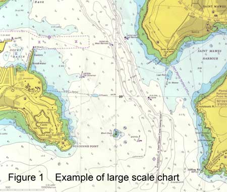
The primary use of charts is to enable surface craft to find their way safely from starting point to destination. So they include information on depth of water, dangers of various sorts, landmarks visible from the sea and navigational aids placed to help vessels to find their way around safely. They also include some information on human activity and "rules" about what you can do where; examples are port boundaries and areas where fishing or anchoring are not allowed. They relate all this to position, by giving you latitude and longitude scales on the chart, and direction by (usually) printing north up.
Charts are used by yacht skippers for navigation and pilotage, and because of the wealth of information they contain they are also useful for other seafarers such as underwater hunters and sightseers (fishermen and divers).
Navigation and Pilotage
The two words navigation and pilotage are closely related, but in yachting terminology they mean slightly different things - and involve slightly different techniques, which you will learn on a practical course.
Navigation is the set of techniques you use when you are out at sea, avoiding any dangers by a wide margin, and usually plotting your position every half hour or so because you are not particularly concerned to know exactly where you are, beyond knowing when you are going to reach your next waypoint or destination.
Pilotage is what you do when you are finding your way into or out of a port or anchorage: you use the chart, but you are close to shore and shallow water, and can probably see landmarks or navigational aids quite close to you. You need to know your position quite precisely, and you might have to keep out of the way of larger less manoeuvrable craft coming in or out.
(To use a driving analogy, navigation could be like driving down the M6 for a few hours, occasionally checking distances to Birmingham/London, or junction numbers. Pilotage is like finding your way through a town with a street map.)
Scale
Charts come in various scales, and are thereby useful for different purposes. Scale simply means the ratio between the physical distance on the chart and the distance that represents in the real world. If a chart scale is 1:100,000 then one milimeter on the chart represents 100 metres real distance.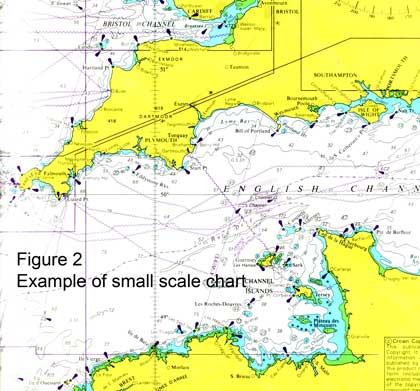
A small scale chart (see figure 2) covers a large area of coastline,and will be useful for navigation between two ports some distance apart; a large scale chart (see figure 1) covers a smaller area but with greater detail - useful for pilotage into or out of port, for example.
On charts that cover large areas, the scale may be slightly different on different parts of the chart (see the section on Projections, below), but don't worry about that for everyday coastal cruising charts.
Chart Plotters
Charts can either be printed, or provided in electronic form for display on chart plotter screens. Neither is "better" than the other: chart plotters can provide very useful functionality, but paper is more reliable (and simpler to learn how it works) so makes a useful backup even if you have a chart plotter.
In practice, some people love chart plotters because they make life easier (they will probably be integrated with the GPS to show your actual position, for example), others hate them because they are overly complicated; it's up to you, but you are going to have to understand the principles of chartwork and navigation whatever you use. On top of that, if you use a chart plotter, you are going to have to study and practise how to operate your particular machine.
In this chapter no distinction is made between the modes of display, because it does not affect what the chart is trying to do. And we don't advise you about chart plotters, because that kind of advice depends on what your particular needs are.
Special Charts and Projections
The vast majority of charts that you will come across are Mercator or Transverse Mercator projections. You can draw a bearing or course as a straight line, and the direction it represents is constant all over the chart.
When someone makes a map, the earth (which is a slightly irregular sphere in shape) has to be represented on the flat surface of a piece of paper. There are various methods of doing this, and all involve slight distortions of one kind or another. The methods are known as projections, and there are dozens of them.
The distortion associated with a mercator projection chart is that the scale will increase with latitude, in order to keep directions constant, and latitude and longitude lines parallel to the edges of the chart. Because of this, when measuring distance on the chart, get used to using the part of the latitude scale that is approximately at the same level on the chart as the area where you are measuring.
Another feature of a mercator projection chart is that, with very small scale (large area) charts, the shortest distance between two points is not a straight line on the chart.
If you are only intrested in a relatively small area of the earth (a few tens of miles) the effect of the distortions is minimal, because the earth can be regarded as pretty well flat over the area in question.
For larger areas (say, a chart from the UK to Spain, or covering the whole width of the Atlantic Ocean) the distortions are greater, so when using these charts it matters more that you understand the distortions. By definition, this affects people who are going to sail longer distances! For this reason we ignore it here, as it relates to Ocean sailing..
In Reeds Ocean Handbook I discuss:
• a different projection - Gnomonic - which can be used to plan long distance sailing
• Pilot Charts, which contain a wealth of information about the different conditions (weather, currents) to be found in certain oceans at different months of the year.
Chart Datum
Charts are drawn using a number of different chart datums in different parts of the world.
Basically, the definition of latitude and longitude is not identical on all charts, largely because the Earth is not a perfect sphere. Differences are relatively small, but large enough to cause problems if your GPS is set up on the "wrong" chart datum.
So one of the first things you do when using a chart is check what datum is being used so that you can set the GPS to the same datum. That way, GPS positions can be plotted directly onto the chart. The datum will be clearly stated on the chart; the next section (Admiralty Charts) tells you where to find notes and general information like this on Admiralty charts.
Of course if you are not using GPS to navigate on the chart, and are perhaps fixing your position with position lines, the chart datum doesn't matter. But it could still cause problems if you are plotting a latitude and longitude from a pilot book or almanac (they are very fond of giving you waypoints, although I prefer to choose my own), or if you read a position off one chart and plot it onto another one with a different datum.
Fortunately in the UK we seem to be standardising on a datum called WGS 84, and if every chart and other reference sticks to that, and you set your GPS to it, you don't have a problem.
Charts Versus Reality
Over-reliance on a chart is just as unwise as over-reliance on any other single source of navigational information. I recently read a pilot book which said that a rock had been discovered "in the traditional way" in the middle of what was previously thought to be a safe fairway.
In the UK we are blessed with very high quality charts based on recent surveys, but even these can contain some surprising errors, or make some "interesting" decisions about what they include or don't include.
Charts are regularly updated, and it is as well to have them corrected (corrections are published for the standard Admiralty charts, and a charting agent will correct your charts for you) or to buy the latest versions. Admitedly, the things that change the most are "human" arrangements like navigation aids, and it would be surprising to say the least to discover a previously uncharted rock in Plymouth Sound or the Solent.
Many charts also include data from nineteenth century leadline surveys (the sources of survey data are shown on Admiralty charts, so look for yourself) and in those days surveying was a much less exact science than it is today.
The further you are off the "beaten track" (and tracks are beaten mainly by commercial shipping) the more you ought to exercise caution about what is charted where. It is no comfort to know that your chartwork was "right" when you hit a rock or coral head (coral can grow quite a lot in 200 years, and the reef was surveyed long before the advent of GPS).
Use your common sense and your eyes. When using a chart plotter, you can "zoom in" until it looks, on the plotter, as if you have masses of room to manoeuvre in. This is a total illusion, and the uncertainty both in your GPS position and in the position of the charted objects would also look pretty big if your chart plotter was able to show them at such a huge magnification. (Perhaps manufactuers of chart plotters should be encouraged to show "fuzzy" positions when excessive magnifications are used.)
Whenever you use a chart, look at the scale and keep an idea in your head of the charted distances you're looking at.
Admiralty Charts
This section gives an introduction to modern Admiralty charts. It tells you the main features and most important/relevant information you are likely to need when learning to be the skipper of a cruising yacht. (Older charts used a different set of colours and symbols and are not dealt with here.)
It is NOT a definitive guide to all the symbols and information you will find on Admiralty charts. We strongly recommend that you buy the Admiralty booklet 5011: Symbols and Abbreviations that contains that information, as discussed at the end of this section.
Notes and General Information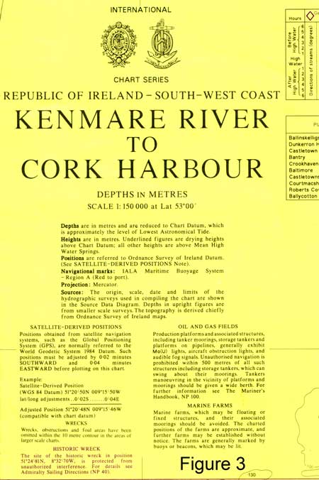
Admiralty charts will have a place where they print the title and general information about the chart: scale, unit of measurement of depths (usually metres, but fathoms for older charts), heights and the datums for depth, height and position. It will state the projection (usually mercator or transverse mercator) and the sources of survey information used in the chart, often with a diagram. See Figure 3.
This is followed by notes: it usually includes a paragraph on "satelite-derived positions" and how much they differ from the charted latitude and longitude, but as explained below the easier approach is to set your GPS to the same datum as the chart.
Other notes will deal with particular navigation hazards in the area, such as local magnetic anomalies (places where you can expect compass errors) fish farms or strong tidal streams.
It's good practice to glance at all this information when you first open up the chart and start planning your passage or pilotage. Personally, I don't find a scale like 1:150 000 particularly easy to visualise, but before using the chart, look at the side (where you measure distance - see Chapter 1) and see how big a mile is on the chart. This is very important when switching between two charts of different scales.
Coastlines and Depths
This is pretty much the most useful information the chart gives you. Depth of water is one of the most crucial things for the safety of vessels.
(It is assumed that you have read the previous section, on Tides: we don't re-explain the tidal terms like MHWS and LAT in this chapter. Read it through again if you are not sure.)
Admiralty charts use colour to give you a quick appreciation of the areas of different depths. Yellow is land, above High Water level, and the black line at the edge of the Yellow is the line of Mean High Water Springs MHWS. Green is the area which "dries", i.e. it sometimes covered by water and sometimes not. The edge of the green is the 0 metres contour, i.e. the line of Lowest Astronomical Tide LAT. It is shown as an uneven line if the coast is rocky.
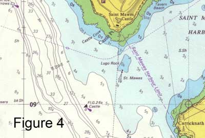
The shallowest water is dark blue, then light blue for slightly deeper, and finally white. There are black line depth contours between the colours, and within the white area. Each contour states its "value" somewhere along the line, but in any case you can quickly see what they are by looking at the charted depth numbers. Figure 4 shows examples of this.
The contours that are shown are not the same on all charts: large scale pilotage charts might show contours at 0m, 2m, 5m, 10m, 15m, 20m, 30m because you are generally interested in using them to get close to the shore. Small scale passage-making charts will have fewer contours, say 10m, 20m, 30m and 50m. Similarly the blue colours are used in the most appropriate way for the scale of chart, for example:
• large scale: dark blue between 0m and 2m, light blue between 2m and 5m, white for greater than 5m (see figures 4 and 5).
• small scale: dark blue from 0m to 10m, light blue between 10m and 20m and white deeper than that.
The numbers are depths in metres - sometimes with a smaller subscript number (instead of using a decimal point) denoting tenths of meters.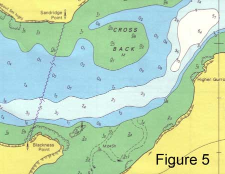
The numbers on the green drying areas are all "negative depths" or drying heights, also in metres, and this is denoted by underlining them. See Figure 5. (These will, of course, be under water when the tide comes in - this is all explained in the Tides section.)
One final point about depths. The sea bed is naturally uneven, sometimes very uneven with rocky (or corally) gullies and pinacles. You can't chart every detail, so in practice you state the LEAST depth at a particular location. This is because charts are drawn mainly for the benefit and safety of surface craft, and what you need to know is the depth of the shallowest bit that you might hit.
Divers should note this. The average depth, or depth in the gullies, will be greater than the depth charted. The same rule applies to wrecks, where the shallowest depth is charted (they are sometimes swept by a wire to make sure that all the wreckage is below a certain depth).
Landmarks
Charts show features on the land that you might see from the sea, or that might be particularly useful in navigation.
Lighthouses and other navigational aids are dealt with in a later section, but in addition to them the chart shows some roads and buildings: hills and height contours: rivers: and in particular, conspicuous landmarks used for navigation. These can be virtually anything: houses, forts, masts, chimneys, even a tree!
They are mainly pretty self explanatory, and you can look up any that aren't.
Dangers and Underwater Features
There are certain symbols that are used on charts that it is worth learning straight away. These are things that could endanger your vessel. They are listed in a specific Dangers section in the reference book.
Chief among these are rocks which are "considered a hazard to surface navigation". They are shown in a variety of ways depending on how accurately their position is represented and how deep they are, or whether they uncover at low water, and most yachtsmen learn to recognise the charted symbols as dangers rather than learning the precise definition of different ones. 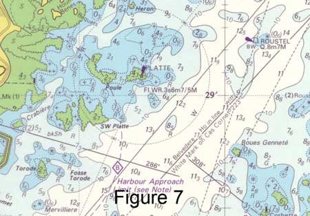
This is a pretty acceptable approach - keep away from all stars or crosses in shallow water, particularly with dark blue around them, with or without surrounding dotted lines! Figure 7 shows a rocky approach to Guernsey - keep away from the dark blue bits, and preferably in the white (>10m) unless you know exactly what you're doing!
There are also many symbols and letters which are used to tell you what is on the sea bed. These include descriptions of the bottom which can be quite useful when deciding where to anchor. But generally, there is more on the chart than the yacht skipper really needs to know (always remember, lots of different people use these charts: large ship skippers and pilots, fishermen, marine surveyors and engineers, etc etc).
Tidal Features and Information
Information on tidal streams is particularly relevant to small craft. This starts with the Notes (see above) which will warn you if there are particular tidal dangers in the area. Generally speaking, "dangers" in this context means:
• streams so strong that they can seriously affect small craft navigation
• streams that, because of their strength, and possibly the effect of uneven underwater terrain, can make the surface conditions dangerous, particularly in strong winds.
There are plenty of examples of both of these around UK coasts!
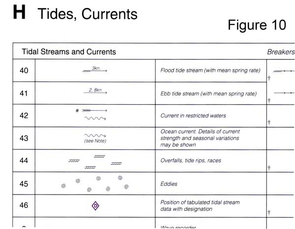
Many Admiralty charts carry quantitative information about tidal streams at particular positions. The position is denoted with a magenta diamond shape containing a letter (referred to as a "tidal diamond"), and data on the speed and direction of the todal streams at that position is given in a table. The Tides section contains a full explanation of this, so I won't repeat it here.
Additionally, some charts show "snapshots" of the tidal streams for the area for each hour before and after High Water, just like a miniature tidal atlas for the charted area. These generally work just like Tidal Stream Atlases, which are also explained in the Tides section.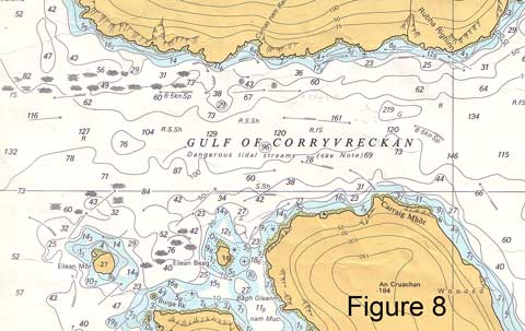
Certain symbols are used on the chart to show where overfalls (or whirlpools!) occur when a tidal stream is running. Overfall means rough conditions caused by a tidal stream and exacerbated by strong winds. Also, arrows are sometimes used to tell you the direction and speed of the greatest tidal streams at flood or ebb. Figure 8 shows the infamous Gulf of Corryvreckan, which has the lot (tidal rates at Springs of 8.5kts).
With this information it is rather up to you to decide how bad the dangers are likely to be, depending on the weather, whether the tides are Spring or Neap, and the time in the tidal cycle. You can usually find fuller information and guidance for yachtsmen in cruising guides and pilot books (remember, charts are used by very large ships where the dangers are a little different). If in doubt, go there when the tide is slack - and be aware of the difficulty of predicting the times of slack water in such a location. (For example in the Gulf of Corryvreckan, I have observed a discrepancy of more than an hour between the almanac prediction of slack water and the actual time of the event.)
Navigational Aids
Navigational aids are generally charted, and as a skipper you need to know:
• what the navigational aid is, and what it is trying to tell you
• how it is charted
• how its characteristics (lights and sounds) are represented, and what the representation means.
This is covered fully in the next section. At this point, we will just mention that Admiralty charts put a helpful magenta flash on anything that is lit at night, and that lighthouses and buoys are represented by distinctive symbols at their charted positions.
Chart 5011: Symbols and Abbreviations 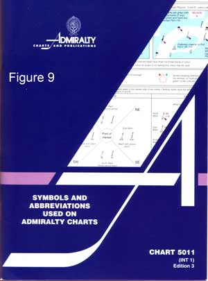
Every skipper should possess a copy of the Admiralty Publication Chart 5011 "Symbols and abbreviations used on Admiralty charts" (see Thematic Charts in the Catalogue). See Figure 9.
This is a completely comprehensive and authoritative definition of all symbols and abbreviations, as published by the same organisation that publishes the charts, and it only costs a few pounds, so there is absolutely no point in using anything else. Figure 10 shows an extract.
Almanacs tend to include a few symbols, but normally a very small number of what they consider to be the most relevant ones, and in the copy I'm looking at no information at all about light characteristics.
Navigational Aids
Navigational aids are buoys, lighthouses or other marks placed on or by the sea to help seafarers. They are usually marked on charts.
Navigational aids come in various shapes and sizes, and their purpose is to assist in safe navigation and pilotage. They can be very helpful to the skipper, but in order to use them safely it important to tie up what you see (buoy, light) with what is marked on the chart.
That way you are continuing this important cross-checking principle, because a buoy might be in the wrong position, or not charted, or showing the wrong light, or you might be making some kind of mistake in identifying it; any of these could lead to a dangerous wrong assumption unless you check for any discrepancy.
Also, the buoy's principle message might not be intended for you; it might be for a large ship. If you see Lateral Marks, for example, and use them to follow the channel, you might be following a large shipping channel, which may be precisely what you don't want to do. Sometimes you are safer, and out of larger ships' way, in slightly shallower water outside the main channel. The way to decide this is to look at the chart.
What follows is an overview of navigational aids and how they are charted, with reference to Chart 5011 for definitive and authoritative detail.
IALA Buoyage System
The International Association of Lighthouse Authorities has standardised the usage of navigational buoys world-wide, and these conventions are known as the IALA Buoyage System.
The following sections describe each of the standard types of mark (buoy or beacon) and how they are generally used, i.e. what they are intended to tell the skipper of a vessel.
Each type of mark has a particular colour, shape and top mark - smaller shapes at the top of the buoy (or beacon) - which further help to define the mark when you are looking at it. Some (but not all) are lit at night. The lights are of a colour and flashing pattern (called light characteristic - explained below) which also assist to identify the individual buoy, and its type.
A "buoy", by the way, is a floating object, anchored and chained in position, whereas a "beacon" is generally stuck into the sea-bed in shallow water, or placed on land.
Lateral Marks
Lateral marks are generally used to indicate the side of a channel of safe water for vessels, very often for entering a harbour, or for safe passage close to the land. There are two types, indicating opposite sides of the channel: Port-hand Lateral Marks and Starboard-hand lateral marks.
There are actually two further marks in the same class, called Preferred Channel Marks, which tell you that you can go either side but one side is the "preferred" channel. These are rare, but are included here for completeness.
Unfortunately, the IALA haven't quite managed to achieve a world-wide standard for lateral marks. This might sound like a fairly catastrophic failure, but it's not as bad as it sounds. There are two fairly distinct "regions", called Region A and Region B. Region B is the Americas, plus an area from the Philippeans to South Korea. Region A is everywhere else, i.e. Europe, Mediterranean, Africa, Indian Ocean, Australia. In practice, any chart will tell you which region it is in, and if you examine the chart for the way the marks are used, it will be obvious. The Lateral marks are different (actually, opposite colours) in the two regions.
In this section we're going to explain the marks for Region A to begin with, and then tell you briefly what the differences are for Region B.
Region A (Everywhere except Americas & Far East)
Port-hand lateral marks look like this. Note the colour: red; the shape:can-shaped, flat top. Some of them have a square or cylindrical top mark (this one doesn't, the thing at the top is a light attached to a radar reflector).
If lit, these marks show a red light, with characteristics stated on the chart (see section below on light characteristics).
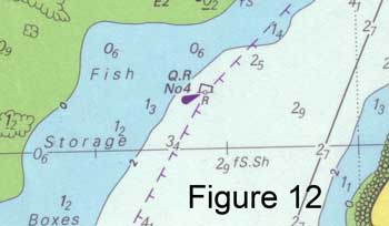
They are charted like this. The little circle at the bottom is the actual position of the buoy. Q.R describes the light characteristics (see below) and the magenta flash shows that it is lit. No 4 is the name of the buoy, which may be written on it.
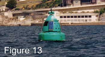
Starboard-hand lateral marks look like this. Colour is green; shape conical, pointed top; top mark (if any) triangular or conical.
If lit, these marks show a green light, with characteristics stated on the chart (see section below on light characteristics).
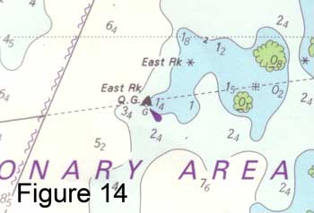
They are charted like this. This one is lit, with a quick flashing green light, and is called East Rock.
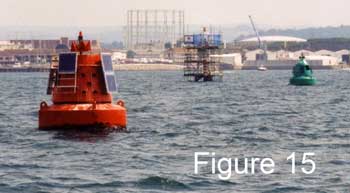 Lateral marks are generally used for well defined channels (or the important edge of a "channel" which may be pretty open on the other side), and the convention is that if you are going in the direction of the flooding tide (which includes going into harbour) you keep the Port-hand Lateral Marks to your port side, and the Starboard-hand Lateral Marks to your starboard side, in order to stay in the channel. Proceeding out of harbour you do the opposite. In the example in Figure 15, the channel into port is from the right of the picture to the left, between the two buoys.
Sometimes the general direction of buoyage (i.e. the direction of the flooding tide) is marked on the chart like Figure 16, but usually it's obvious when you look at the chart.

Finally the two rare ones. If you see what looks like a Port-hand Lateral Mark (red) but with a green stripe through it, there is a channel to either side of it, but for the "preferred" channel treat it as a Port-hand Lateral mark. Similarly a green mark with a red stripe through it should be treated as a Starboard-hand Lateral Mark for the preferred channel, but you may be able to go either side of it. These are, of course, charted, and are illustrated in 5011 Symbols and Abbreviations - see figure 17. As shown in 5011, these marks are given a specific light characteristic if lit. 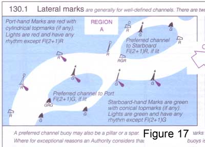
Region B (Americas, and Philippines to South Korea)
In Region B the shapes and top marks are the same as Region A for Port-hand and Starboard-hand, but the colours are reversed.
Red (conical) buoys are therefore kept to the starboard side when following a channel into harbour, and they have a saying which helps them to remember this: "red right returning" (learn it in an American Accent!).
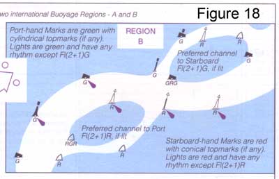
Similarly Green (can-shaped) buoys are kept to port in those circumstances.
The rarer preferred channel markers work as you would expect, with a green stripe through a red Starboard-hand Mark and a red stripe through the green Port-hand marker.
Just remember: the colours are reversed, everything else is the same. Figure 18 shows what 5011 has to say on the matter.
Cardinal Marks
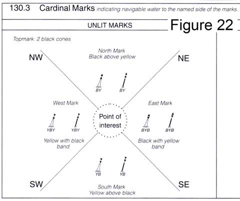
The second "family" of IALA marks are the four Cardinal Marks, named North Cardinal, South Cardinal, East Cardinal and West Cardinal after the four cardinal points of the compass.
These marks are used more generally to indicate shallow water, or a danger, rather than the side of a channel. In each case, clear water is on the side of the buoy indicated by its name. Thus for an East Cardinal, clear water is to the east of it; and so on for each of the Marks.
But again, beware of this simple rule: you need to look at the chart to work out what the mark is trying to tell you, and who its message is intended for. If you "assume" (always a bad word) that you should pass to the east of an East Cardinal Mark when you see it ahead of you, you might run onto the very danger it is trying to warn you about. Or you might just be wasting your time, because the "danger" is for larger craft.
With that health warning, they are extremely useful and easy to identify, so it is well worth learning them.
North Cardinal Mark: 
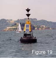
South Cardinal Mark: (see figure 19)
East Cardinal Mark:
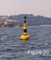
West Cardinal Mark: (see figure 20) 
To help remember these, most people invent some sort of rule or pattern, and here are mine (no better than anyone else's). They're all yellow and black, so you can say with total authority that is is a cardinal mark before you work out which one it is. Look at the top-marks: most people find 2 cones (triangles) pointing up easy to remember as North, and 2 pointing down pretty obvious as South. The East topmarks resemble an Egg (just) and the West a W on its side, or Wineglass.
 As to the colours, their positioning follows the same logic as the topmarks: just remember that the cones point towards the Black. So with North the black is at the top, South it's at the bottom. With East it's top and bottom and with West it's in the middle.
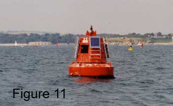
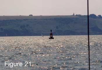
Just a word of warning - it's not so easy to make out the colours with "real" buoys as it is with illustrations in the book, because of the extra bits of buoy (solar cells etc), the way they are constructed, and paint rusting off. Look at the topmarks if you can, they may be easier to see. Figure 21 shows a cardinal buoy in difficult light - hard to see the colours, but relatively easy to see the topmarks of a south cardinal.
 As expected, these buoys are all marked on the chart in a logical manner, with the topmarks providing the easiest way of distinguishing between them. Here is the relevant entry in 5011 Symbols and abbreviations. B and Y are the colours Black and Yellow, and the colours are read from the top.
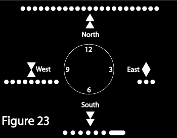 If lit, these marks have particular light characteristics which are fairly easy to remember (and are also marked on the chart). Just think of a clock face with the marks placed around it (see figure 23). East is at 3, South at 6, West at 9 and North at 12. The east cardinal flashes 3 times; the south 6 plus a long flash; the west flashes 9 times and the north flashes continuously. All the lights are white.
Safe Water and Isolated Danger Marks
Less widely used (certainly in the UK) than the Lateral and Cardinal Marks, these two indicate:
Safe Water - e.g. some distance off the entrance to a safe channel, to assist in locating it, and an isolated danger, such as a shallow rock or wreck.
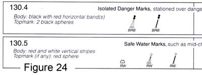
 The Safe Water Mark is red and white, in vertical stripes, with a single red sphere as a top mark (if there is one). Safe water is all around (in fact the only hazard is the buoy itself!), and once again it can be identified on the chart.
If lit, it is white, either isophase, occulting or a long flash (see below for explanations of these terms).
![]() The Isolated Danger Mark is stationed over a danger, and there is navigable water all around it (but not close to it). It is black and red, in horizontal bands, and the top mark is two black spheres. The chart will show you details of the danger, such as how shallow and extensive it is.
The Isolated Danger Mark is stationed over a danger, and there is navigable water all around it (but not close to it). It is black and red, in horizontal bands, and the top mark is two black spheres. The chart will show you details of the danger, such as how shallow and extensive it is.
If lit, it is a white light flashing in groups of two flashes - Fl(2). See below.
 As expected they are marked on the chart, with an indication of the top marks and colours. Figure 23 shows how 5011 describes this.
Special Marks
There are other buoys that have a right to be out there, but aren't placed there for the purposes of navigation. They are there for a different reason. The reason isn't always important, but the buoy is there, and most of them are marked on the chart, so they can be helpful to us for fixing or confirming our position.
They are called Special Marks, and they are yellow, can be any shape, and may have a topmark which is a yellow cross.
If lit, they flash a yellow light.
Other Navigational and Pilotage Aids: Daymarks; transit marks; channel marks
There are a variety of other types of mark used to guide you into harbours etc. These are outside the scope of the IALA buoyage system, and indeed may or may not be marked on charts, although the chances are that the established ones will be. Certainly pilot books / cruising guides will give you plenty of information about them, and how to use them when piloting into/out of a harbour or anchorage.
Certain parts of the coast tend to have their own ideas on these: here in the south west of England there are a quite a few unlit Daymarks - substantial structures built high up on the cliffs, sometimes painted in conspicuous colours, and marked on the charts. They are there purely to assist navigation, usually to help craft to find a particular harbour.
On other parts of the coast white marks may be painted on rocks, or cairns built, or sticks and branches ("whithies") stuck into the mud to show the edge of a channel. The variety is as wide as human ingenuity, and the methods are adapted to local conditions.
Everywhere, natural features or buildings unconnected with navigation are used as guides, and very often marked on charts as well as cruising guide plans.
Transit Marks
A particular favourite for leading craft into a harbour is transit marks. These have the advantage that, when you keep them lined up, they keep you on a defined straight line, even though you may have started your approach from any direction and you may have to cope with strong wind or tide.
For main harbours, they are often markers which are deliberately constructed in the correct place, painted in bright colours, charted, sometimes lit, and maintained by the harbour authority. For minor anchorages they may be natural features, which are described in the pilot books.
There is one convention to be aware of. Transit marks are always arranged so that the one nearest to you is lower than the further mark. This means that you can always work out which way to go to get them in line. Say the bottom one is to the left of the top one, turn left to get them back in line. (Sometimes it helps if you imagine a line which starts at the higher back marker, goes through the lower front marker, and then out towards you - your job is to stay on that line.)
Lights
Some, but not all, buoys and beacons are lit at night.
In addition, other objects are lit. These may be lights which are arranged as navigational aids, or objects which may be in the way of shipping at night, and need to be seen to be avoided.
In whichever category, objects which are lit at night are a) usually given a distinctive flashing pattern and colour(s), and b) marked on the chart with a description of their light characteristics. This section introduces how the light characteristics are described. Once again, the full definition of the way they are all described is contained in Chart 5011 Symbols and Abbreviations.
The fullest description of a light characteristic will be something like this:
Fl(3) R 10s 13m 5M
That would be for a lighthouse, and for a buoy you might just have: Fl(3) R 10s or even shorter: Fl R.
We'll look at each part of this in turn, tell you what it means, and outline what other possibilities there are in each element.
Fl(3)
That means flashing, in a group of three flashes - followed by a pause, then another 3 flashes. "Flashing" implies quite a slow rate of flash (rate of less than 50 per minute). Instead of Fl, you could have: Q (quick flashing) VQ (very quick flashing) or UQ (ultra quick), or LFl which is a long flash (2s or more). If there is no number in brackets, the flashing is continuous.
Note that Q, VQ etc have precise definitions in terms of the number of flashes per minute, and these are given in 5011.
Besides "flash" (which means the duration of light is shorter than the duration of darkness) lights can do other things. F means fixed (i.e. continuously on); Oc means occulting, so that the light is mainly on and goes off for short periods; and Iso, for isophase, which means on and off for equal times. If it is occulting, that may be a group of "off flashes" e.g. Oc(2), but that wouldn't make sense with F or Iso.
Occasionally you see something like (2+1) which means that the flashing pattern is two followed by another one after a short pause.
The other thing you might see here would be IQ or IVQ or IUQ. This means quick (or very quick or ultra quick) flashing, interrupted for a period of time, before resuming. Personally I find these very confusing, because your natural inclination is to count the flashes, and it isn't always the same number between interruptions!
R
Red. Other colours are W (white), G (green), Y (yellow, orange or amber), Bu (blue) and Vi (violet) - these last two are unusual. If no colour is stated, it's white.
If there are two (or more) colours mentioned, it may be a sectored light or direction light (see below).
10s
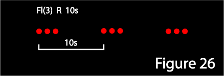 This is the period of the repeating pattern. This is a period in the mathematical sense, i.e. the length of time it takes for the whole pattern to repeat itself. In this example (Fl(3) ... 10s) it is the time from when the three flashes start, till when the flashing starts again. It is NOT the duration of the pause between the flashing.
If there is no repeating pattern of flashes or occulting, it is omitted: hence Q R for example, where the quick flashing is continuous.
13m
This is the height of the light above sea level in metres, which enables you to judge how far away it can be seen from, over the horizon. (Like all heights it is referred to the height datum of the chart, which is normally MHWS and is stated on the chart.)
Note that this isn't necessarily the height of the lighthouse building - the light could be on a small structure placed on top of a cliff or hill.
If this is omitted (usual for buoys) the light is close to sea level.
5M
This is the luminous range, nominal visible range of the light, in nautical miles, in good visibility. I.e. it is related to how bright the light is. Note that with lighthouses, the range at which you see the light is generally determined by its (and your) height and NOT by this number. It is generally omitted for buoys, which aren't intended to be seen many miles away.
Lighthouses, Shore Lights and Floating Lights
The IALA buoys are not the only navigational aids that may be lit at night. There is an array of different night-time navigational aids, mostly on-shore but some which are floating.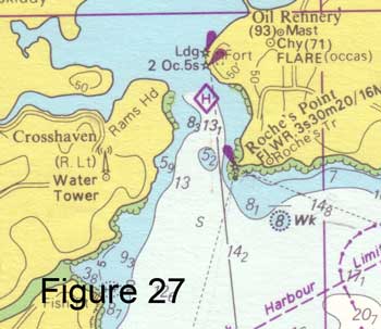
Figure 27 show how lighthouses and other shore lights are charted. They are represented by a black star, with a magenta flash to say they are lit - and of course the light characteristics are written beside them. In this example you can see the major lighthouse at Roche's Point (lights 30m high) and two leading lights further into Cork harbour. Interestingly there are also two other examples of things you might see at night that aren't navigational aids as such: a radio mast on the west side of the entrance with (R. Lt) beside it, which tells you that there is a red air obstruction light on it (for warning aircraft); and FLARE (occas) at the oil refinery on the East side.
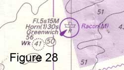
Figure 28 shows an example of a ligh vessel (which will be familiar to listeners to the shipping forecast on Radio 4). There are a few similar symbols (see 5011).
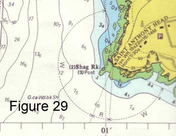 Something which is quite common in lights provided to guide vessels into harbour is the sectored light, which shows as a different colour in different directions. These can be arranged to that, for example, the light you see when you are in the safe channel is white and the light you see when you are approaching a danger is red. Figure 29 shows an example of such a light, where the light characteristic mention the two colours W and R, and the chart shows the sectors in which those colours are visible.
Direction lights can be used to guide vessels up channels. They are sometimes sectored lights, with a central white sector seen when you are in the channel, flanked by red and green to show whether you are on one or other side of the channel. Alternatively they can shine only in a particular direction, with reduced or no light seen if you are either side of a particular bearing from the light. Chart 5011 Symbols and Abbreviations shows examples of this.
Sounds
Both buoys and lights may be designed to make a sound so that you can get some idea of what direction they are in, in fog. Buoys - especially remote buoys along the coast - can have a bell or a kind of mournful hooter, both of which are activated by the motion of the buoy in the sea. Lighthouses can have a wider range of sounds and can be louder. In both cases the sound is described on the chart, according to the abbreviations in Chart 5011.
It's probably true to say that with the advent of cheap portable GPS navigators, the sort of navigation that relied on these sounds in fog is becoming more rare.